
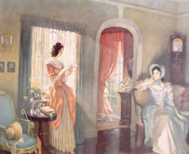
 My house is pretty butch! Maybe that’s not the best way to describe it. But, there’s no question it leans WAY to the masculine in terms of décor so one could question why this prissy old print hangs in my guestroom. It’s by an artist named Fredrick Mizen who worked during the first half of the last century. It’s called Love Letters and this particular pic belonged to my paternal great grandmother. Being in good condition and the original frame it’s worth the small fortune of $250 – at best. Evidently Mizen’s work was very common and today is readily available.
My great grandmother passed in the 1970’s so I never really knew her. That’s her in the black and white photo – the large women. The other woman is my father’s aunt. The aunt was still in high school when this photo was taken sometime in the mid 1950’s. She’s pushing 80 today, still going strong and probably still the hit of the local bowling alley.

 I was quite good at conceptualizing unique and original home designs. I was even better at redesigning the typical ranch which was the rage at the time. My additions of indoor pools, multi-level bathrooms and interior atriums took the basic ranch to an entirely new level. As a budding home designer I was perplexed with Love Letters. From a floor plan perspective, those women’s house made NO sense to me. There was a huge exterior window impossibly placed and immediately next to it was an interior door leading to another room. I attempted floor plan after floor plan to try to justify the artist’s interpretation of the houses layout, but to no success. To make things worse, even as a ten year old I knew what these women’s house really would have looked like.
 My father’s other Aunt (a church lady not bowling alley queen) lived in an old plantation house. At some point she sold the old house and built a big boring ranch. But, she lived in it late enough that I remember it and thought it was grand! It was very typical of the period and under no circumstances did the architectural situation depicted in the print mimic the aunt’s house.
 I also I had major issues with the Love Letter’s window treatments. Growing up in
 My grandmother told me the women were reading a letter from their love interest who was at war fighting the Yankees. I think she was wrong. I was sure the letter was probably from the Historical Society, DAR or Women’s Auxiliary League outraged by the women’s obvious ill-designed renovation and the hiring of a failed interior designer and the letter was telling them to get that house back in shape.
 Now, years later I find myself again staring at Love Letters and feeling exactly the same – there’s a bunch of messed up stuff going on here in a not so good piece of art (don’t get me started on how many times I rethought those dresses). However, I’m still as intrigued as I was as a ten year old. But, now I’m intrigued by what has stuck with me as opposed with what doesn’t make sense. I could hang Love Letters in any room in my house and it would blend into the wall color. As you know, everything in my house is grey, gray, or greige like that old money green wall color in Love Letters. Also, I’m a big believer in glossy white trim and white ceilings and most importantly I live in the real version of that house and my renovation wasn’t botched!
No comments:
Post a Comment